In our blog on Mary Grace: A Gracious and Grace-filled Brand, we talked about its ‘brand personality‘ and how Mary Grace remained consistent and cohesive which partly enabled this brand to grow to become one of the leading casual dining restaurant chains in the Philippines.
In this blog, we will talk about ‘brand identity‘ which not only includes brand personality, but also the brand name and the brand logo (aka ‘visual hammer‘).
“A brand is something that has a clear-cut identity among consumers, which a company creates by sending out a clear, consistent message over a period of years until it achieves a critical mass of marketing.”
Phil Knight, Co-Founder and Chairman Emeritus of Nike
In our blog on LEGO®: A Prolific Product Strategy Built Brick by Brick, we talked about the ideal sequence in developing the brand architecture which involves four critical phases. For easy reference, I’m sharing the four phases again here:
- Phase 0: Find and choose an open hole to occupy in the market
- Phase 1: Define Brand Strategy (brand positioning + unique selling proposition + supporting evidence)
- Phase 2: Develop Brand Identity (brand name + visual hammer or logo + brand personality)
- Phase 3: Develop Brand Marketing or the 6 P’s of the Marketing Mix
The ‘brand identity‘ is the third of four phases in the sequence. Therefore, when developing the brand identity, it is assumed that phase 1 (finding and choosing the open hole), and phase 2 (defining the brand strategy) have already been finalized by the brand owner.
It is a common misconception that ‘branding’ is all about just ‘Phase 3-Brand Identity‘.
It’s a lot more than that.
Nonetheless, ‘brand identity‘ (brand name + ‘visual hammer’/logo + personality) is a very critical and strategic part of the whole brand architecture. It is also the first major visual expression of the brand strategy.
Therefore, it is imperative to get this phase right from the very start.
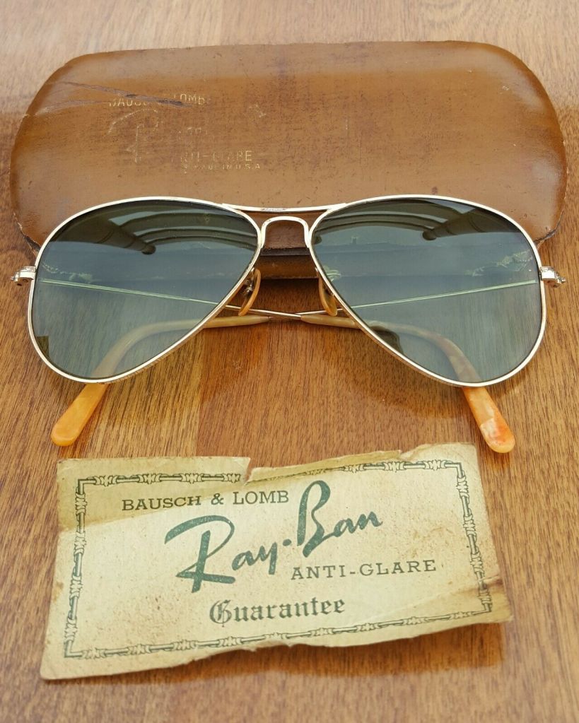
One of the brilliant brands which has done an excellent job on ‘brand identity’ is Ray-Ban®, the top-selling eyewear brand on earth.
The Brand Name
The choice of brand name to express the strategy is always a tricky part. This is because there are simply so many ways of going about choosing a brand name.
Some useful guidelines include: The brand name should be –
- Meaningful – it communicates the brand essence
- Distinctive – unique and memorable
- Accessible – people can easily interpret, say and spell it
- Protectable – can trademark, can get domain and own
- Future-Proof – can grow with the company
- Visual – can communicate through design, including icons, logos and colors
Some brand name techniques that we’ve seen in history include:
- Founders – Ben & Jerry’s
- Descriptive – General Motors
- Fabricated – Google, Xerox, TikTok
- Metaphor – Burger King, Leads Gorilla
- Acronym – DKNY, KFC, BMW
- Play on Words – Facebook
In the case of Ray-Ban®, it is a combination of technique 2 (descriptive) and technique 6 (play on words). In 1929, the original brief by US Army Air Corp Colonel John A. Macready to Bausch & Lomb was simple: “we need something to ban the rays of the sun and look cool”.
Hence the brand name, ‘Ray-Ban‘.
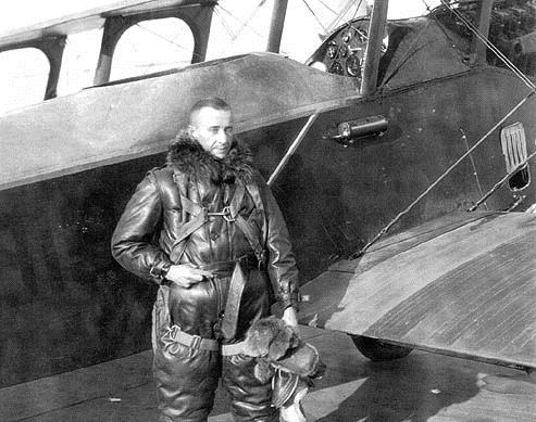
Since pilots during that time were flying farther, faster, and higher than ever before, these pilots would return with massive headaches and altitude sickness due to the bright sun. Lieutenant General John MacCready, who himself holds the record of being the first pilot to fly coast-to-coast (New York to California) for 26 hours, 50 minutes and 48 seconds, called up Bausch & Lomb. The company then worked on the brief which eventually gave birth to the original and iconic Ray-Ban Aviator which was launched to the public in 1937.
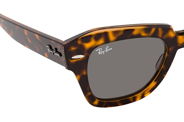
The Brand Logo
In the website of the automated branding platform Tailor Brands, they provide a good five-point guide for developing a logo:
- Simple – this is key in order to stand-out in a cluttered market
- Relevant – the logo must appeal to the people in the market whom the brand aims to attract
- Memorable – brilliant brands are so memorable that these can be identified even by just seeing a small portion of their logos
- Timeless – designs which are not based on fads are able to last through generations
- Versatile – the number one guide relating to simplicity is a great enabler in the versatility of a logo – the simpler the logo, the more versatile
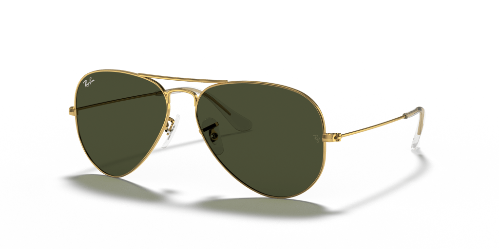
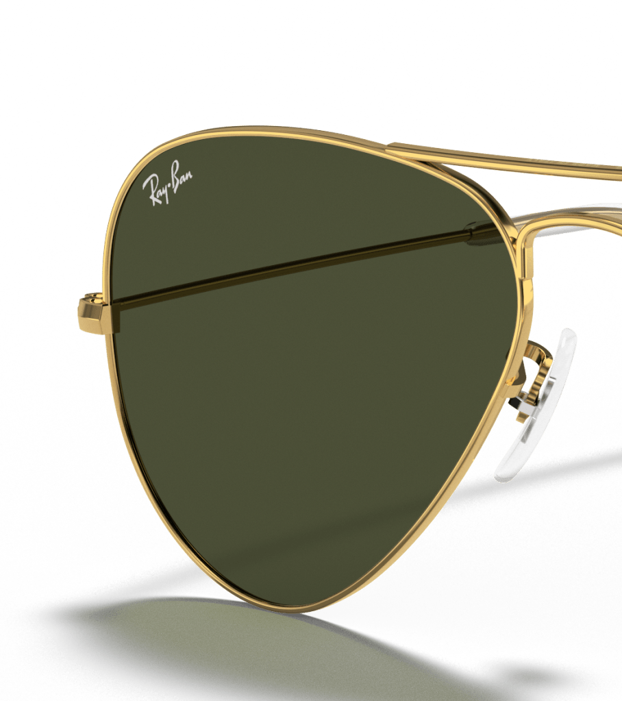
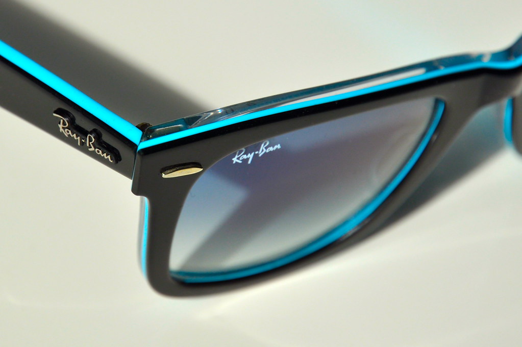
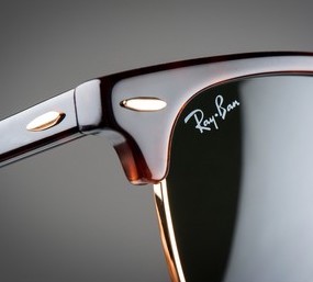
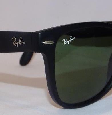
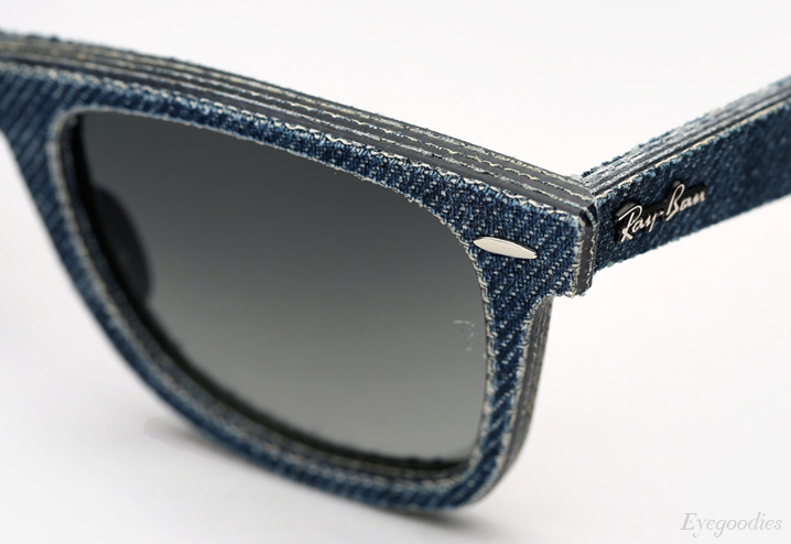
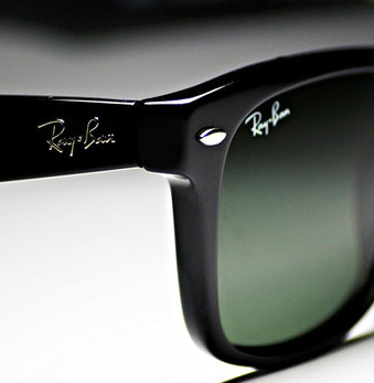
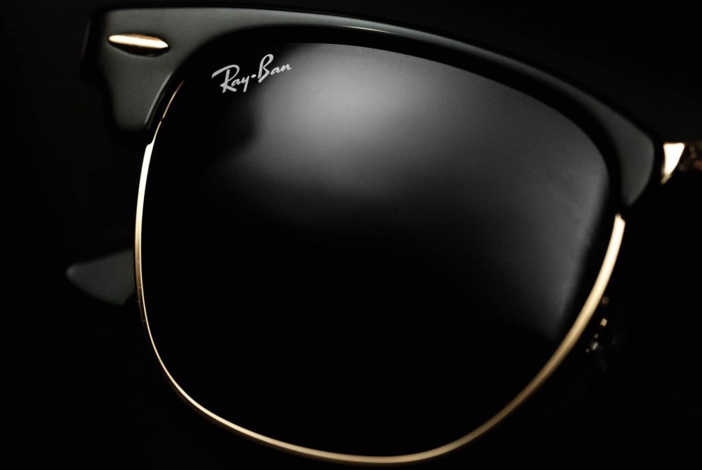
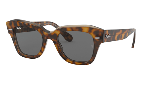
Having finalized the brand name ‘Ray-Ban‘, the brand then created its logo using a custom script that is shown to be going on an upward direction which supports the brand image of an active and outdoor lifestyle. The upward diagonal presentation of the brand complements the custom typeface they created. It looks free-flowing and suggests positive energy, dynamism and some exuberance.
Clean, simple and uncomplicated, the Ray-Ban® logo ensures instant brand recognition globally. It is also a truly fashion logo ‒ elegant, engaging and playful.
The Ray-Ban® wordmark appears in white on red. White represents freshness, sophistication and order. Red attracts attention and evokes a strong emotional reaction. Paired together, they make the image look confident and youthful.

The Brand Personality
It must look ‘cool‘ was the simple and clear direction of Colonel Macready to Bausch & Lomb back in 1929.
“Being cool has nothing to do with age; it has to do with how solid your identity is.”
Gary Vaynerchuk, Chairman of VaynerX
It is undeniable that Ray-Ban® has been at the forefront of ‘cool‘ throughout it’s 84-year history. It didn’t hurt that the brand was worn by many of the iconic personalities in politics, arts, movies and music.
With its brand identity very cohesive and clearly defined, it inevitably found its natural habitat in the company of famous celebrities during very memorable moments in history.
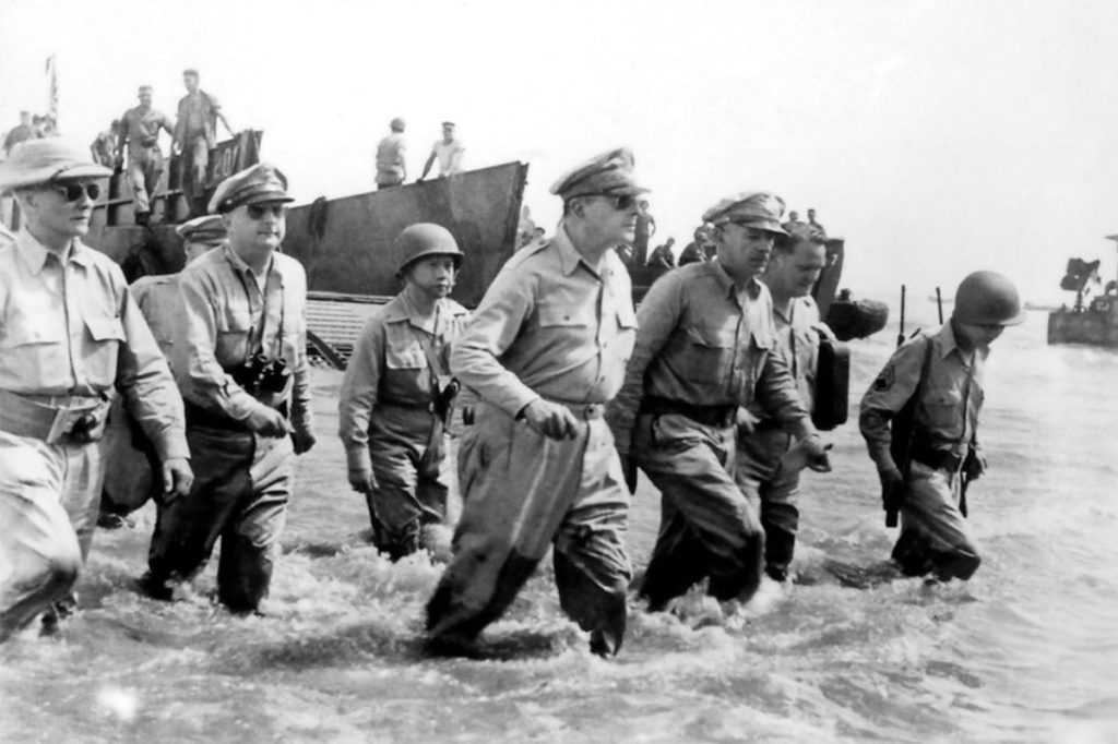
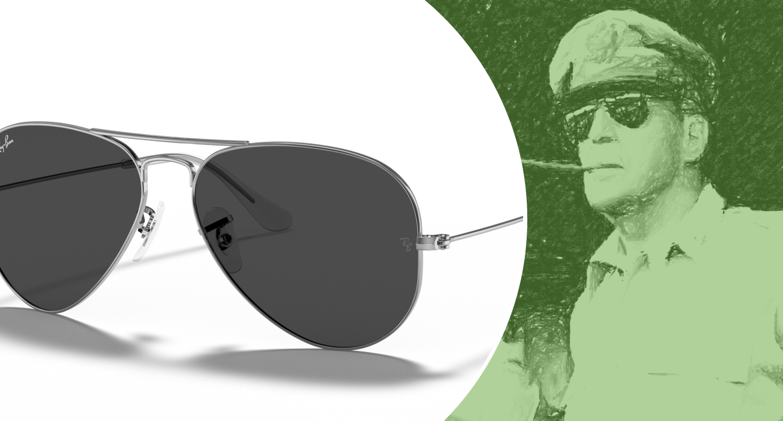
It is said that it is actually General Douglas MacArthur who first popularized the Ray-Ban Aviators. When he landed back in 1944 in the Philippines during World War II, the photojournalists on hand helped spread the image of the general wearing his Aviators globally which later became very popular in the French Army.
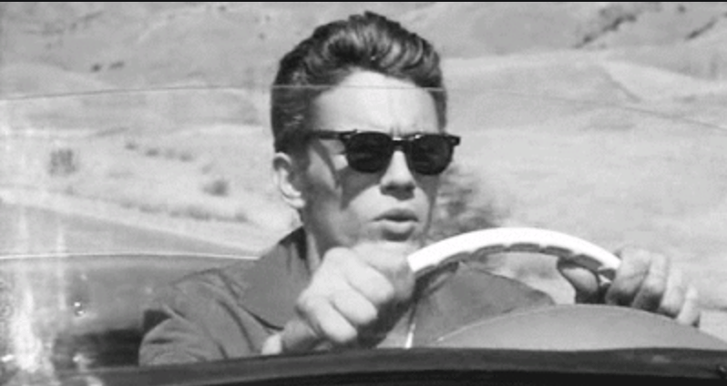
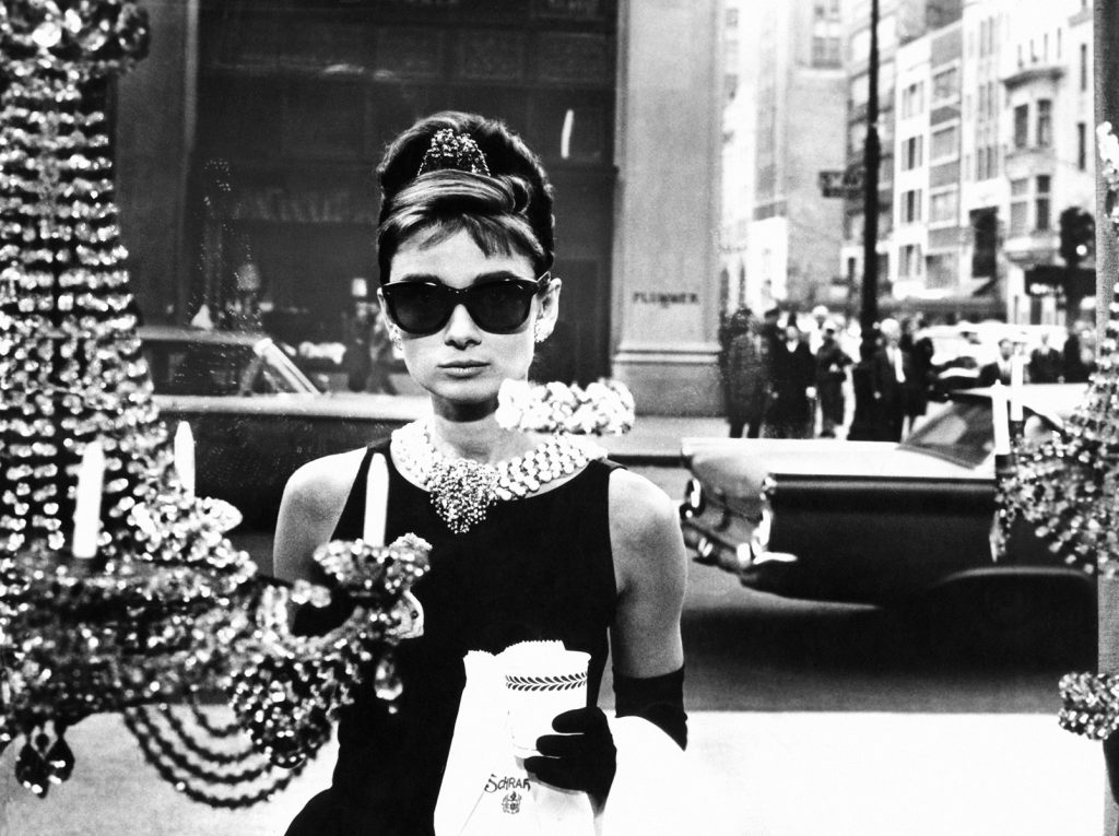
In the 1950’s, at the wake of the Second World War, Hollywood was having an increased impact on fashion. Launched in 1952, the Ray-Ban® Wayfarer became such a highly-recognized fashion accessory after this was seen worn by celebrities in their roles in movies like James Dean (Rebel Without a Cause, 1955) and Audrey Hepburn (Breakfast at Tiffany’s, 1961), and more.
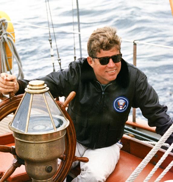
35th US President John F. Kennedy was often seen in public wearing Ray-Ban® Wayfarers during his brief term in the early 1960’s.
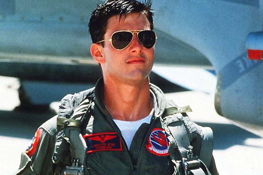
More recently, Tom Cruise brought back the popularity of the original Ray-Ban® Aviator Classic when he played the role of Maverick in the hit movie Top Gun in 1986. It was reported that the appearance of the Ray-Ban® Aviator in the movie caused a 40% increase in sales of the product during that year.
Very cool indeed.
Today, Ray-Ban® continues to hold a key position in the conglomerate and global eyewear leader Luxottica Group, based in Milan, Italy, which bought the brand from Bausch & Lomb back in 1999 for US$640million. The group holds almost 40% share of the global eyewear market and Ray-Ban® leads the large stable of eyewear brands of the conglomerate which includes Oakley, Prada Eyewear, Ralph Lauren Eyewear, to name a few.

Ray-Ban® teaches us its excellent approach in developing a cohesive and consistent brand identity, based on a solid brand strategy. It started with a descriptive and playful brand name, partnered with a simple and energetic brand logo, and wrapped up in a very cool brand personality.
This powerful combination has created an iconic and enduring brand identity that has stood the test of time.
ANNOUNCEMENT
Branding Nerd has joined forces with adobo Talks and will be holding a three-part webinar on foundational lessons and principles about branding.
Click here to reserve your slot.
You can indicate your reason for choosing ‘No‘ here.

I would like to have a original ray-ban
LikeLike
Thank you Lorimer for visiting!
LikeLike